The BMTC Logo Explained: History, Colours & Meaning
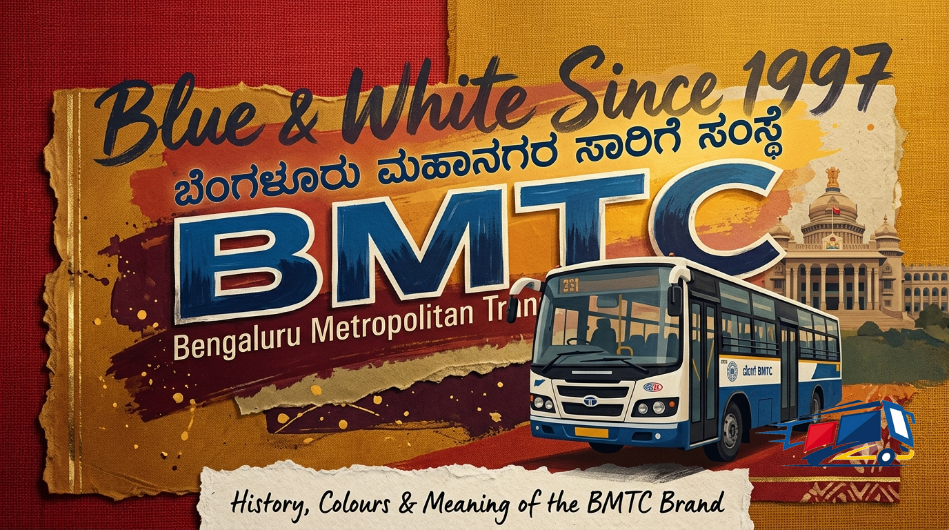
The BMTC logo is a wordmark, not a picture symbol. It spells out the Bengaluru Metropolitan Transport Corporation's name in Kannada and English, in the blue and white the city's buses are known for. Here is the story behind it.
Search for the BMTC logo and most people are really after one of two things: what it looks like, and why the buses are blue and white. The short answer is that BMTC does not use a mascot or icon. Its mark is the corporation's own name, written in Kannada and English, in a blue and white palette that has defined the brand since 1997. The richer story sits in the colours.
| Key fact | Detail |
|---|---|
| Logo type | Name-based wordmark, no icon or mascot |
| House colours | Blue and white, in use since 1997 |
| Kannada name | ಬೆಂಗಳೂರು ಮಹಾನಗರ ಸಾರಿಗೆ ಸಂಸ್ಥೆ |
| Big change | Red dropped in 1997; "Bangalore" became "Bengaluru" in 2014 |
| Seen on | Bus front and sides, tickets, passes, the app |
What the BMTC logo actually is
It is a wordmark: the corporation's name in Kannada and English, plus the letters BMTC, in blue on white.
There is no wheel, lamp or animal hidden in it. The mark leads with the Kannada name ಬೆಂಗಳೂರು ಮಹಾನಗರ ಸಾರಿಗೆ ಸಂಸ್ಥೆ (Bengaluru Mahanagara Sarige Samste), pairs it with the English name, and uses the four initials as a short form. One honest note: BMTC has never published an official breakdown of any deeper symbolism, so write-ups that claim the mark "represents" this or that are guessing. What is certain is the wording and the palette.
| Element | What it is |
|---|---|
| Kannada name | ಬೆಂಗಳೂರು ಮಹಾನಗರ ಸಾರಿಗೆ ಸಂಸ್ಥೆ, the full legal name |
| English name | Bengaluru Metropolitan Transport Corporation |
| Short form | BMTC, the four initials |
| Palette | Corporation blue on white |
The colours and what they signal
Blue and white is the brand. The fleet then layers extra colours to tell services apart.
Where the meaning really lives is on the buses, not the wordmark. After 1997 the brand settled on blue and white, and a later fleet overhaul, led by Bengaluru design studio Idiom, organised more than a dozen bus types into a handful of colour families so commuters could read a service from a distance. The team has said it drew on the city's identity as the Garden City. The result is the colour map below.
| Colour | Role |
|---|---|
| Corporation blue | Core brand colour |
| White | Base / body colour |
| Green | Electric & trunk services |
| Service | Livery | What it runs |
|---|---|---|
| Bengaluru Sarige | Blue and white (dark for older, lighter for newer) | Standard non-AC city buses |
| Vajra / Vayu Vajra | Light blue | AC city and airport buses |
| Astra | Light green or violet and white | Electric non-AC buses |
| Samparka | Orange | Mini neighbourhood buses |
| BIG10 | Green and bottle green | Major corridor routes (G prefix) |
| BIG Circle | White | Ring road routes (C or K prefix) |
Want your brand on Bengaluru's buses?
Get a route plan, format recommendation and pricing, usually within a minute.
How the look has evolved
The identity has shifted three times: a colour change, a name change, and a fleet redesign.
The mark and livery did not arrive fully formed. They tracked the corporation's own milestones, from the red buses of the old transport service to today's green electric fleet.
| When | What changed |
|---|---|
| Pre 1997 | Bangalore Transport Service ran a red colour scheme |
| 1997 | BMTC formed; livery switched to blue and white |
| 1 Nov 2014 | Wordmark updated from Bangalore to Bengaluru |
| Mid 2010s | Fleet reorganised into colour-coded service families |
| 2020s | Green and violet liveries added for electric buses |
From a distance you read the colour before you read a single word. That is the whole point of the system, and it is also why a branded bus stands out: the body is a clean canvas wrapped around a mark people already trust.
Where the logo sits on a bus
The mark stays small and fixed, usually on the front and sides, leaving the body open.
On a standard bus the identity occupies a modest spot near the front and along the upper side, with the route board doing the heavy lifting for passengers. The same mark repeats across tickets, passes, depots and the Namma BMTC app, so it travels far beyond the vehicle itself.
| Surface | Role of the mark |
|---|---|
| Bus front and sides | Small fixed identity, paired with the route board |
| Tickets and passes | Printed wordmark for proof and recognition |
| Depots and stations | Signage and official boards |
| Namma BMTC app | Digital logo across the rider experience |
The brands that share the bus with it
The logo never moves, but the body panels around it are open for advertising.
Because the identity takes up so little of the surface, the long side panels, the rear and even full wraps are available to brands through approved transit advertising. The BMTC mark stays untouched, which is the rule, and a campaign simply rides alongside it on the parts of the bus built for messaging.
| Surface | Carries |
|---|---|
| Front badge and route board | BMTC identity, fixed |
| Side panels | Brand advertising |
| Rear panel | Brand advertising |
| Full wrap | Brand advertising, identity preserved |
If you are weighing where a brand could sit, our bus branding solutions cover wraps and panels, and you can read our explainer on what BMTC is, or pick a specific area such as Koramangala.
Frequently Asked Questions
What does the BMTC logo look like?+
The BMTC logo is a wordmark rather than a picture symbol. It carries the corporation's name in Kannada and English with the letters BMTC, set in the brand's blue against white, the same palette the buses wear.
What are the BMTC colours?+
Blue and white. The pair was adopted in 1997, replacing the older red of the Bangalore Transport Service, and now anchors the brand and most of the standard fleet, with extra colours marking specific services.
What does the BMTC text mean?+
The Kannada text reads Bengaluru Mahanagara Sarige Samste, which is Bengaluru Metropolitan Transport Corporation in English. The four letters BMTC are simply the initials of that full name.
Why are BMTC buses blue and white?+
Blue and white became the BMTC look in 1997, when the Bangalore Transport Service was reorganised into the corporation and the older red livery was dropped. The scheme has defined the fleet ever since.
Has the BMTC logo changed over time?+
Yes. The wordmark was updated on 1 November 2014 when the name moved from Bangalore to Bengaluru, and the fleet was later reorganised into colour-coded service families to make each type easier to read.
Can advertisers use the BMTC logo?+
No. The name and emblem are state property and stay on the bus untouched. Brands take the open body panels around the identity through approved transit advertising, never the logo itself.
Bus Branding Glossary
- Full bus branding (wrap)
- A full vehicle wrap covering both sides and the rear of the bus, the highest-impact, most visible format.
- Bus back / rear branding
- Advertising on the rear panel of the bus, in the line of sight of traffic queued behind it at signals and junctions.
- Side panel branding
- Branding on one or both side panels of the bus body, facing pedestrians and parallel traffic along the route.
- Vajra / AC service
- BMTC's premium air-conditioned (Volvo / Vayu Vajra) services, carrying a higher-income commuter set on IT and airport corridors.
- TTMC
- Traffic and Transit Management Centre, a large BMTC bus terminal where many routes start, terminate and interchange.
- Depot
- The BMTC facility where buses are parked, serviced and from which many local routes originate.
- Dwell time
- How long a bus stays in view of a stationary crowd, at a stop, signal or in slow traffic, which lengthens brand exposure.
- Corridor
- A main arterial road (e.g. the Outer Ring Road or Hosur Road) that a bus route runs along, defining who sees the branding.
How to run a BMTC bus branding campaign
Five simple steps from enquiry to a live, tracked campaign on Bengaluru's buses.
- 1
Pick your area & audience
Tell us the Bengaluru area or corridor you want to reach and who you're targeting, IT professionals, shoppers, students or residents.
- 2
Choose a format
Select a format, full bus wrap, rear panel, side panel or premium AC/Vajra service, based on your budget and the impact you want.
- 3
Select routes & bus count
We map the high-frequency routes and stops that cover your audience and recommend how many buses to brand.
- 4
Approve the creative
Share your artwork (or we help design it). We prepare it to BMTC specifications and get the approvals.
- 5
Go live & get proof
We print, wrap and deploy the buses, then share proof of display so you can see your brand on the road.
Bus Branding Formats
Choose how your brand rides, pick the format that fits your goal and budget.
Bus Branding Across Bengaluru
We run BMTC bus branding in every major Bengaluru neighbourhood. Explore more areas:
Outdoor & Transit Advertising Specialists
We plan, design and run BMTC bus branding campaigns across every major Bengaluru corridor, matching brands to the routes, formats and audiences that deliver the most visibility.
Discover More
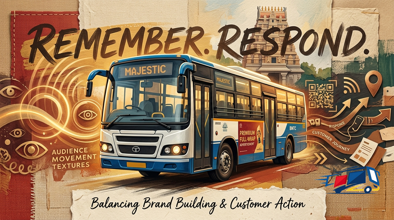
Brand Awareness vs Response Campaigns on Buses
What bus branding does best: awareness or direct response? A comparison of the two campaign types on buses, why a moving vehicle favours brand-building, and how to blend both.
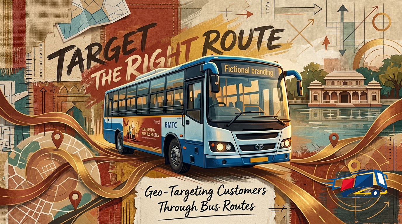
Geo-Targeting With Bus Routes: Advertising Where Your Customers Are
A bus route is a geo-targeting tool you can drive. How to map your customers to the routes they use, think in catchments instead of points, and stack corridors to cover a neighbourhood or a whole city.
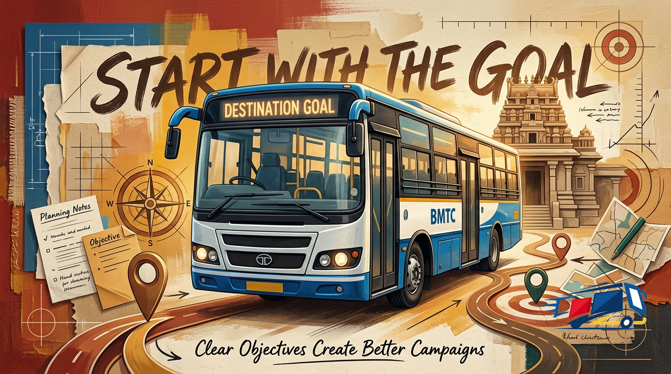
Setting Campaign Objectives Before You Advertise
Why setting one clear objective before you advertise decides everything: awareness vs consideration vs response, how each maps to a different message, format and KPI, and how to write a SMART objective.