Bus Wrap Design: Dos and Don'ts That Get Noticed
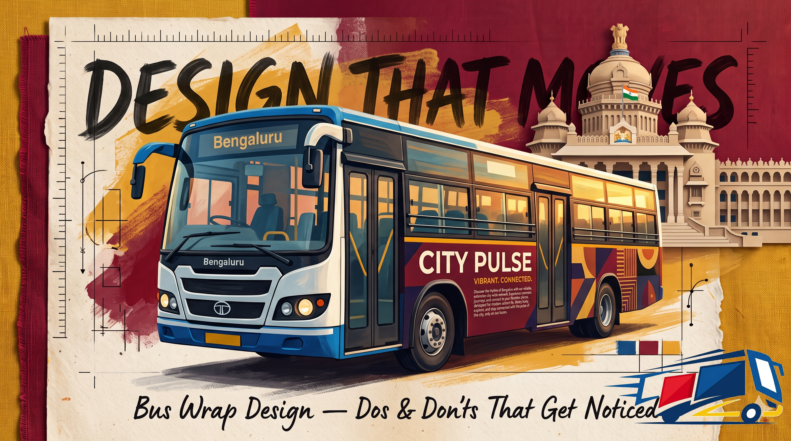
A bus wrap is read in seconds, often by someone moving, from across a busy road. That changes every design rule you know from screen or print. The wraps that get noticed do a few things right: big simple type, hard contrast, one clear message, and a layout built for the bus, not a flat page.
Key takeaways
- A moving wrap is read in 3 to 5 seconds, so one clear message beats a busy design.
- Use the 10-by-1 rule: every inch of letter height reads from about 10 feet away.
- High contrast and bold sans-serif type are what stay legible at speed.
- Design around the bus, its windows, doors and wheels, so nothing key is cut off.
- Kannada must make up around 50% of the text on Bengaluru bus wraps.
You are designing for seconds, not minutes
A bus wrap is not a brochure. The viewer is often walking, driving or waiting, and your message has a few seconds at most. That single constraint should shape every choice in the design.
| Medium | Viewing time | Design implies |
|---|---|---|
| Print / screen | Seconds to minutes | Detail is fine |
| Bus wrap | 3 to 5 seconds | One bold idea only |
So the goal is immediate comprehension, not artistry for its own sake. If a person cannot grasp who you are and what you offer in one glance, the wrap has not done its job, however beautiful it looks up close.
Legibility and the 10-by-1 rule
There is a simple yardstick for type size. Every inch of letter height is readable from roughly ten feet away, so size your text for the distance you actually need it read from.
| Letter height | Readable from about |
|---|---|
| 3 inches | 30 feet |
| 6 inches | 60 feet |
| 10 inches | 100 feet |
| 12 inches | 120 feet |
Pair the size with the right typeface. Bold sans-serif fonts read fast; scripts and thin or heavily decorative fonts blur at distance or in motion. If a logo uses a stylised font, repeat the name in a clean font elsewhere on the bus.
Want your brand on Bengaluru's buses?
Get a route plan, format recommendation and pricing, usually within a minute.
Colour and contrast do the heavy lifting
Contrast is what makes a wrap pop from across a road. Light text on a dark field, or dark on light, reads instantly; similar tones blur into mush at any distance.
Build a clear message hierarchy
Decide what the viewer should see first, second and third, then design to that order. The brand and one core message should dominate; everything else is support.
Keep it to one idea. A wrap that tries to say five things says nothing, so resist cramming in every product, offer and detail. Lots of negative space around the few elements you keep is what makes them land.
The Kannada requirement on Bengaluru buses
There is a local rule that shapes every Bengaluru bus design: around half the text on the wrap should be in Kannada. Plan the layout around it from the start, not as an afterthought.
| Element | What it means for design |
|---|---|
| Kannada share | About 50% of the text |
| Layout | Plan space for both scripts early |
| Legibility | Both languages must read at speed |
| Resonance | Kannada connects with local riders |
This is not just compliance. Kannada speaks to the city's commuters in their own language, so a well-set bilingual wrap reads as local and trusted rather than imported. Build the two scripts in together so neither feels squeezed.
The dos and don'ts, at a glance
Most wraps succeed or fail on the same handful of choices. Here is the short version of what to do and what to avoid.
- Keep one clear message the eye gets at a glance.
- Use bold sans-serif type, sized by the 10-by-1 rule.
- Go high contrast and bright.
- Design around windows, doors and wheels.
- Use high-resolution artwork so nothing pixelates.
- Plan the Kannada share from the start.
- Overcrowd with text, offers and images.
- Use script or thin fonts that blur in motion.
- Pair similar tones that vanish at distance.
- Place key elements over windows or wheels.
- Stretch low-res images into a blurry mess.
- Bolt on Kannada late as a squeezed afterthought.
A great bus wrap is not the one with the most on it. It is the one a stranger can read, understand and remember before the bus has passed.
We design wraps built to be read on the move
Good wrap design is a craft: sizing type to the 10-by-1 rule, pushing contrast, setting a clear hierarchy, fitting the artwork to the bus's windows and curves, and building in the Kannada share so it reads local and compliant. Share your brand assets and one core message, and our design team will turn them into a wrap that gets noticed at a glance, then prints crisp and installs clean.
See how campaigns come together under bus branding in Bengaluru, or explore the wider craft in transit advertising.
Frequently Asked Questions
How big should the text on a bus wrap be?+
Use the 10-by-1 rule: every inch of letter height is readable from about ten feet. Size your key text for the distance you need it read from.
What fonts work best on a bus wrap?+
Bold sans-serif fonts. Scripts and thin or decorative fonts blur at distance and in motion. If a logo is stylised, repeat the name in a clean font.
What colours should I use?+
High contrast ones: light text on dark or dark on light, plus bright accents. Avoid similar tones, and use the greyscale test to check legibility.
What is the most common design mistake?+
Overcrowding. Trying to say everything means the wrap says nothing. Keep one clear message and let negative space make it stand out.
Is Kannada text required on Bengaluru bus wraps?+
Yes. Around 50% of the text should be in Kannada. Plan the bilingual layout from the start so both scripts read well and the design stays compliant.
Why does designing around the bus matter?+
Because windows, doors, handles and wheels can cut off or distort key elements. Fitting the artwork to the bus's shape keeps the message intact from every angle.
Bus Branding Glossary
- Full bus branding (wrap)
- A full vehicle wrap covering both sides and the rear of the bus, the highest-impact, most visible format.
- Bus back / rear branding
- Advertising on the rear panel of the bus, in the line of sight of traffic queued behind it at signals and junctions.
- Side panel branding
- Branding on one or both side panels of the bus body, facing pedestrians and parallel traffic along the route.
- Vajra / AC service
- BMTC's premium air-conditioned (Volvo / Vayu Vajra) services, carrying a higher-income commuter set on IT and airport corridors.
- TTMC
- Traffic and Transit Management Centre, a large BMTC bus terminal where many routes start, terminate and interchange.
- Depot
- The BMTC facility where buses are parked, serviced and from which many local routes originate.
- Dwell time
- How long a bus stays in view of a stationary crowd, at a stop, signal or in slow traffic, which lengthens brand exposure.
- Corridor
- A main arterial road (e.g. the Outer Ring Road or Hosur Road) that a bus route runs along, defining who sees the branding.
How to run a BMTC bus branding campaign
Five simple steps from enquiry to a live, tracked campaign on Bengaluru's buses.
- 1
Pick your area & audience
Tell us the Bengaluru area or corridor you want to reach and who you're targeting, IT professionals, shoppers, students or residents.
- 2
Choose a format
Select a format, full bus wrap, rear panel, side panel or premium AC/Vajra service, based on your budget and the impact you want.
- 3
Select routes & bus count
We map the high-frequency routes and stops that cover your audience and recommend how many buses to brand.
- 4
Approve the creative
Share your artwork (or we help design it). We prepare it to BMTC specifications and get the approvals.
- 5
Go live & get proof
We print, wrap and deploy the buses, then share proof of display so you can see your brand on the road.
Bus Branding Formats
Choose how your brand rides, pick the format that fits your goal and budget.
Bus Branding Across Bengaluru
We run BMTC bus branding in every major Bengaluru neighbourhood. Explore more areas:
Outdoor & Transit Advertising Specialists
We plan, design and run BMTC bus branding campaigns across every major Bengaluru corridor, matching brands to the routes, formats and audiences that deliver the most visibility.
Discover More
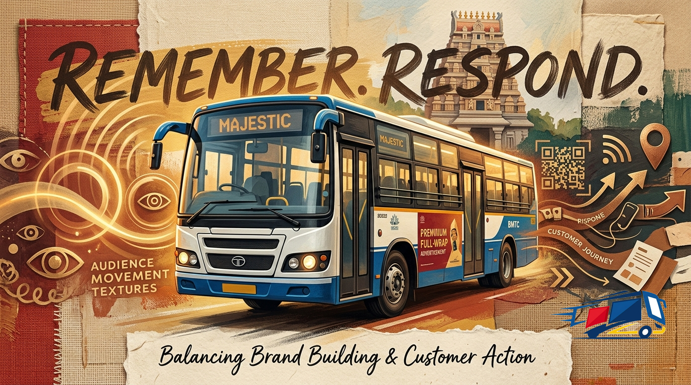
Brand Awareness vs Response Campaigns on Buses
What bus branding does best: awareness or direct response? A comparison of the two campaign types on buses, why a moving vehicle favours brand-building, and how to blend both.
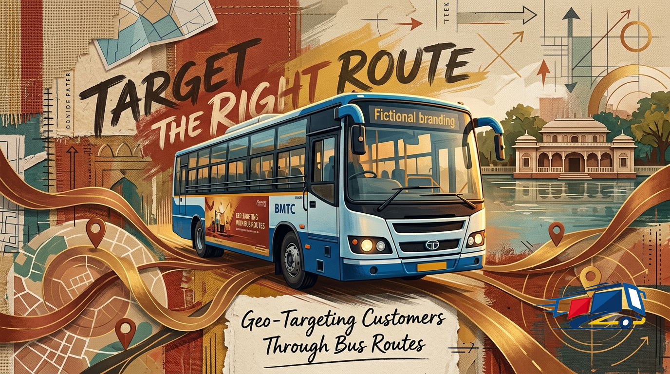
Geo-Targeting With Bus Routes: Advertising Where Your Customers Are
A bus route is a geo-targeting tool you can drive. How to map your customers to the routes they use, think in catchments instead of points, and stack corridors to cover a neighbourhood or a whole city.
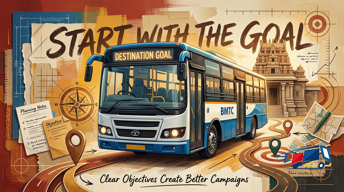
Setting Campaign Objectives Before You Advertise
Why setting one clear objective before you advertise decides everything: awareness vs consideration vs response, how each maps to a different message, format and KPI, and how to write a SMART objective.